iPhone 7 Plus Portrait Mode
If you own the iPhone 7 Plus, you’ve probably been waiting for the Portrait Mode camera feature to finally arrive on your beloved device. Well, wait no more. iOS 10.1 was released yesterday and the still beta Portrait Mode (or Depth Effect) was finally released to the masses.
If you don’t know what I’m talking about, Apple’s Portrait Mode on iPhone 7 Plus (the first iPhone with two cameras on the back of the device) is more or less an attempt at adding a faux depth of field to photos taken with the iPhone 7 Plus. This is something you’d normally see in photos that were taken with a very wide aperature lens and a (d)SLR camera. If you don’t what any of this means, Google “depth of field” and “bokeh”. In simple terms, the foreground of an image is sharp and in focus, while the background is blurry and out of focus. Shallow depth of field gives a photo character, and it also looks pretty sweet.
Here are some random shots I took around the house with the iPhone 7 Plus with Portrait Mode enabled. These photos are all unedited.
It should be said that Portrait Mode is intended to be used with people and faces, and results may vary with inanimate objects. Since I don’t take a lot of photos of people (I do take a lot of photos of my pets though, and Portrait Mode works pretty well with their cute little faces...maybe I'll do another blog post with edited, pretty iPhone 7 Plus pet photos next!), I decided to test it on the very things that Apple would rather I not, inanimate objects. [Spoiler: I’m impressed.]
You can see the full resolution images here: https://flic.kr/s/aHskKj1JBr
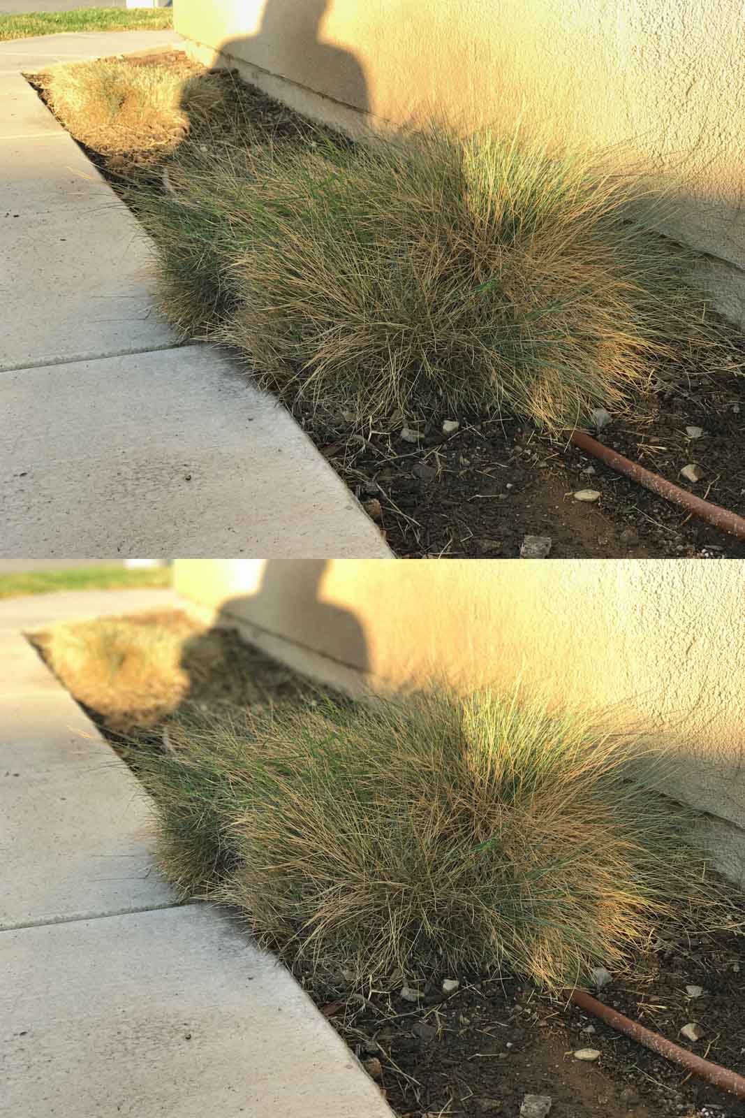
This one was tricky for sure. I’ve noticed that the effect works best if the object (or subject, or person) is in contrast to its background. Grass has a lot of individual blades that may not be recognized as being in the foreground, especially when the background is similar in color and contrast to the grass. Overall, this photo turned out well. The grass is distinct from the background, while a subtle blur was applied to the wall and dirt behind the grass.
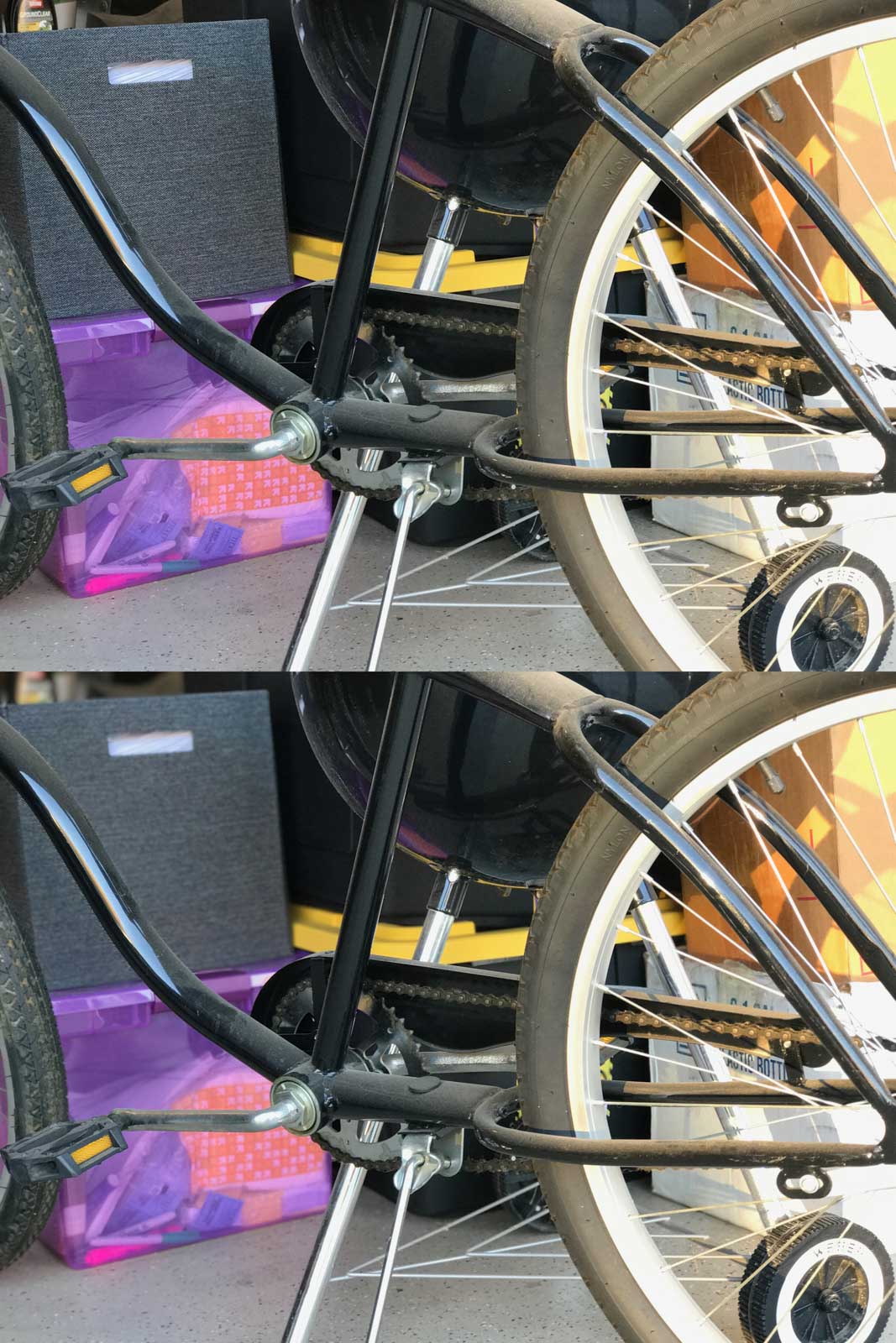
Let’s complicate it it even more. In this shot, I was focusing on the bike frame. A very subtle blur was applied to the background and I think it was just enough to keep the photo looking natural and realistic. This bike also has many open spots that allow the background to be seen, which the image processor seems to have handled fairly well, but not well enough.
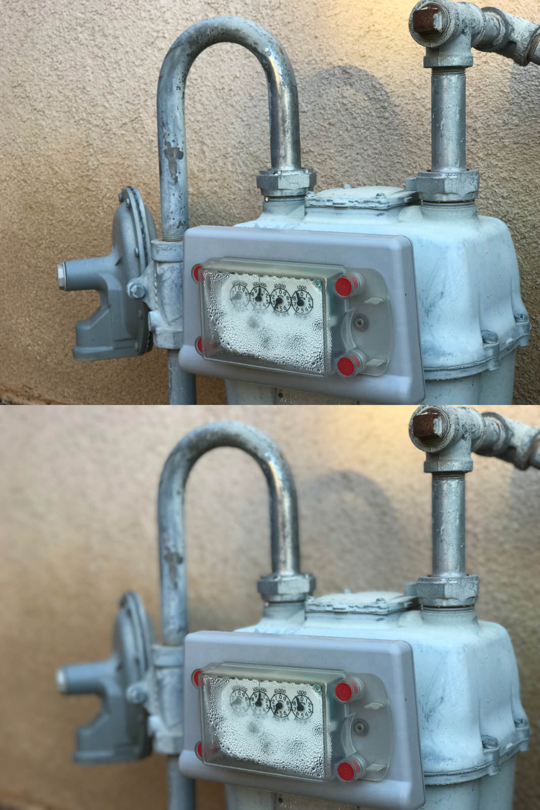
This photo has fairly good contrast between foreground and background. I like that the entire gas meter is not in focus, only what’s closest to the camera. A gradual background blur is then applied the the rest of the meter, with the wall being the most blurred. Impressive, but a tad unrealistic.
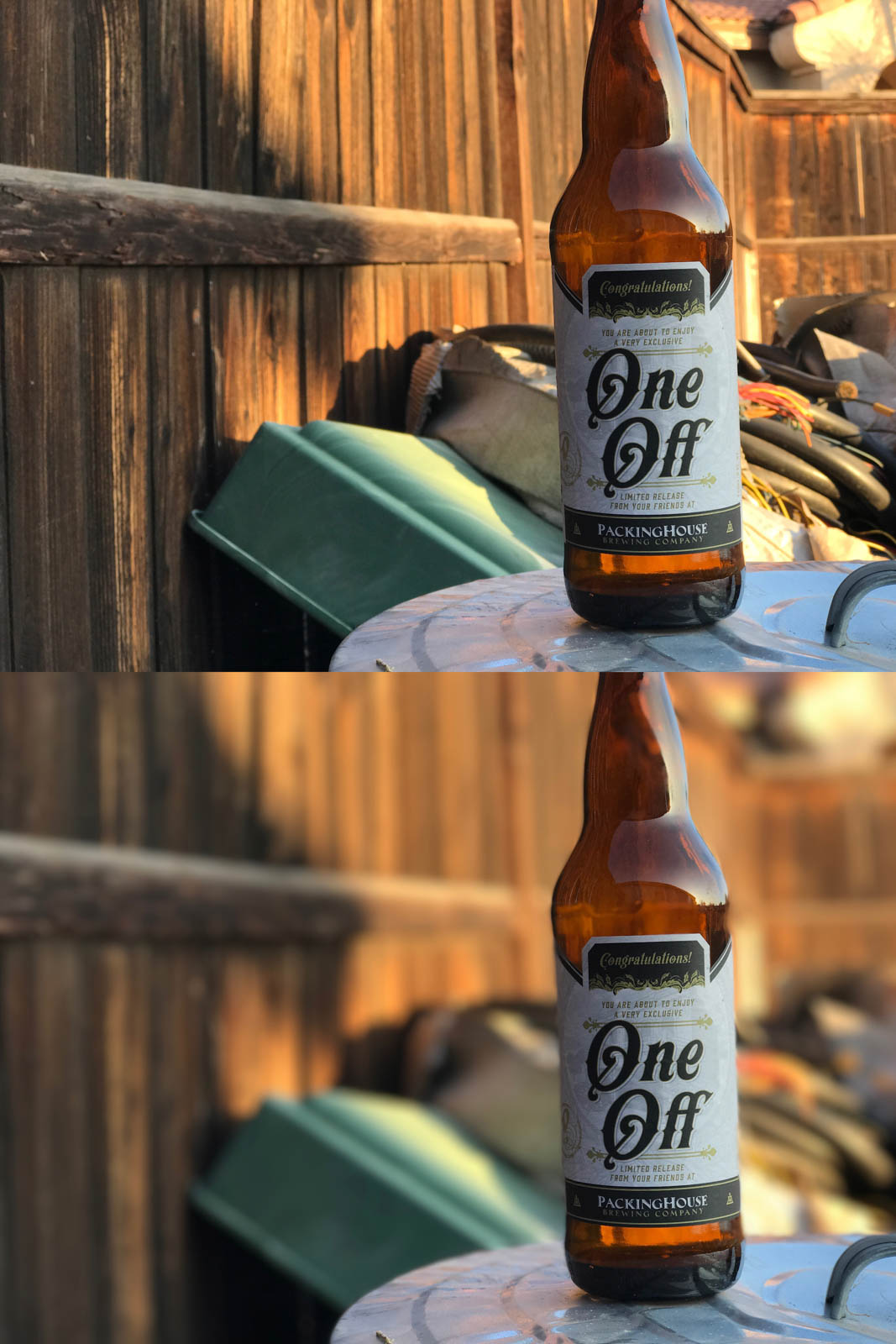
Beer bottles are tough for Portrait Mode. They’re reflective, don’t have clearly defined edges (unless it’s against a distinctly contrasting background), and tend to blend in easily with their surroundings. Overall, this image looks good. There are a few spots where the edges of the bottle and the brown fence confused the processor, but overall, it’s passable on a pocket-sized mobile device.
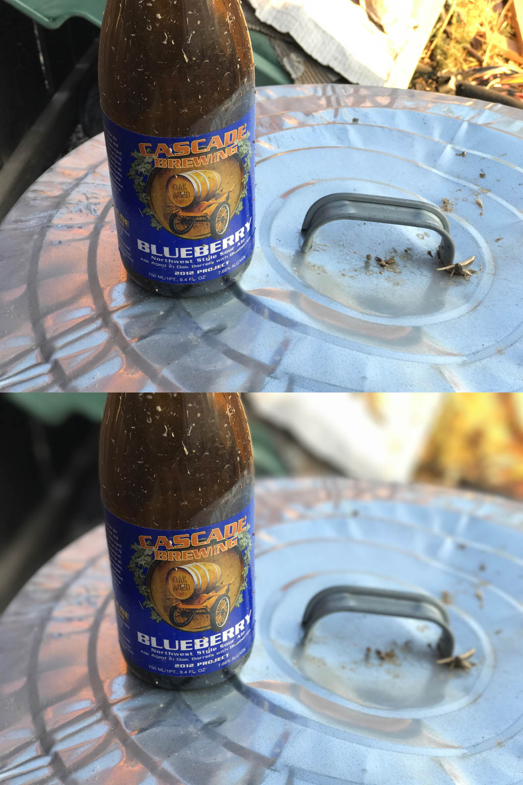
This shot turned out a little better than the first bottle photo. My main issue is with the handle on the lid of the trash can. It’s on the same plane as the bottle, yet it was still blurred. Again, this is minor but it’s noticeable enough to look a little off. But, it’s impressive, nonetheless.
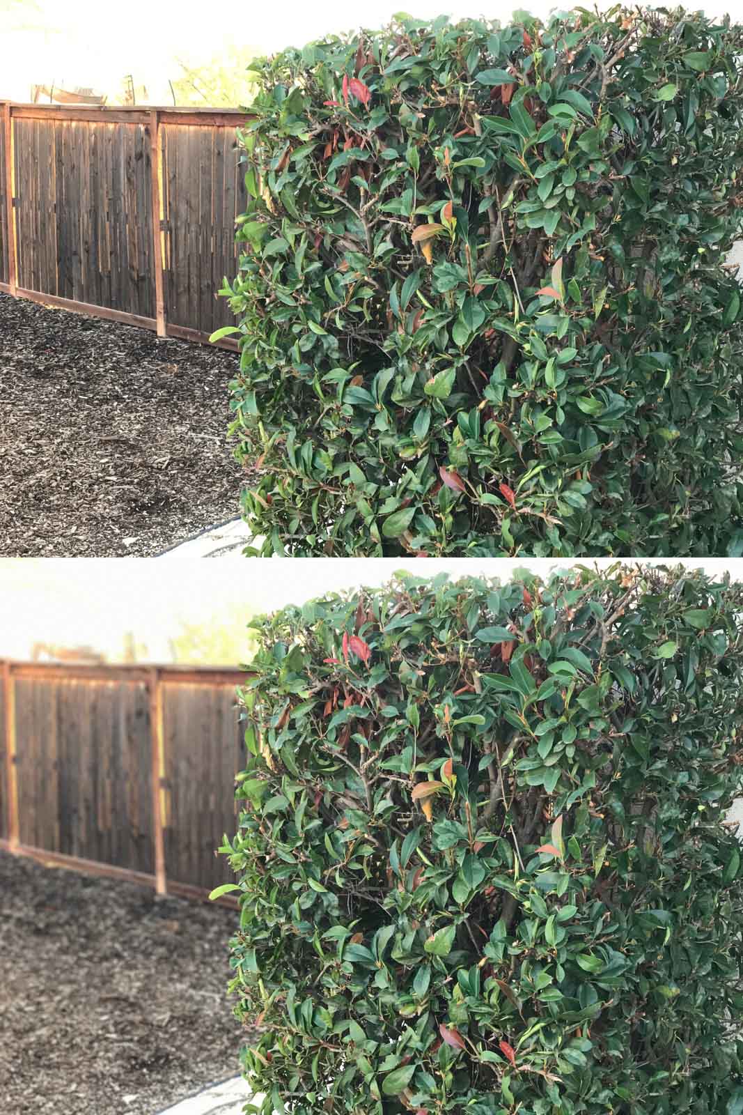
I expected good results with this shot. It’s a softball for the the camera since the bush is square in contrast to the background. Note how the blur gets stronger in the background from bottom to top—that's smart. Thumbs up to the performance, but I will admit that it’s a boring photo.
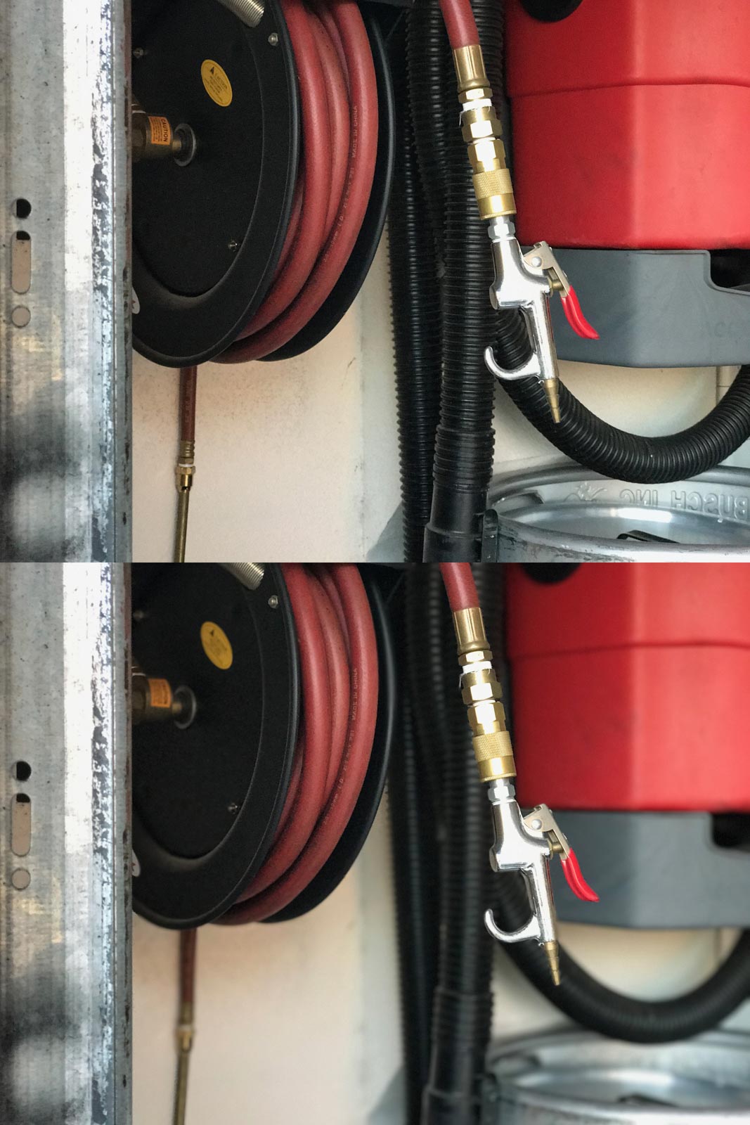
While this photo isn’t too exciting, the image processor did a great job separating the hose and air nozzle from the red background. The live preview of this photo (yes, you see the Depth Effect live on the screen before you press the shutter button) was a bit off—the nozzle was out of focus and looked bad. But, I took the photo anyway and it came out great.
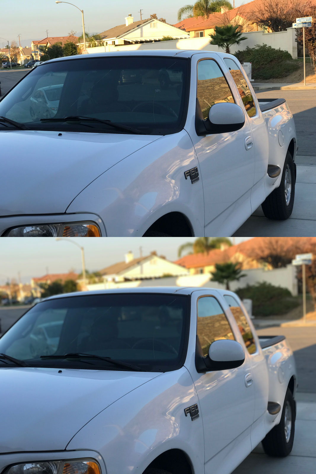
This photo of my truck looks so good to me. The blur is natural and gradual. The truck is nicely separated from the neighborhood and is sharp and crisp.
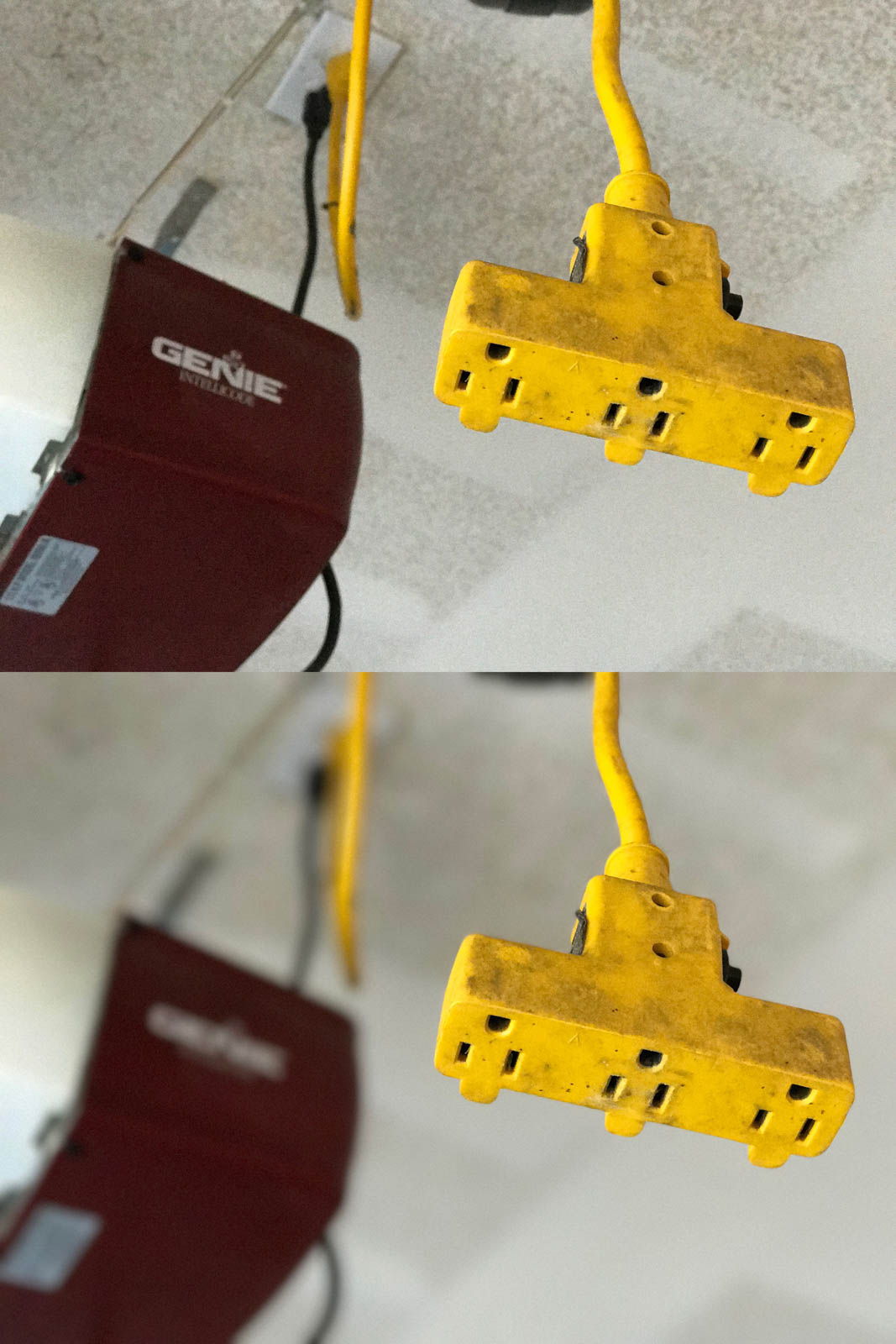
This is a yellow extension cord with an outlet that hangs from my garage ceiling. Again, high contrast helps out the image processor a lot. The background blur is gradual and natural.
There you have it. While Portrait Mode isn’t perfect, it’s really, really impressive. The photos taken here were not meant to be used with this feature, yet it still performed well. With a little bit of post-processing, these photos could really stand out in my Instagram feed.
Full resolution images: https://flic.kr/s/aHskKj1JBr
 Post a Comment